ROLE:
Designer
TOOLS:
Figma Figjam Procreate
SCOPE:
4 weeks
TIMEFRAME:
April 2023

MBTA: College Art
SKILLS:
Contextual Research, Digital Interaction Design, Mobile Design
COURSE:
Interaction Design 1: Responsive
about.
How might we foster community engagement in a fleeting environment?
In this assignment we were tasked with identifying user pain points and UX themes at the local train station. We then were expected to brainstorm various design solutions and determine the best problem/solution to proceed with. After that, had to create an abundance of deliverables to get to our final physical and digital design solution.
empathize.
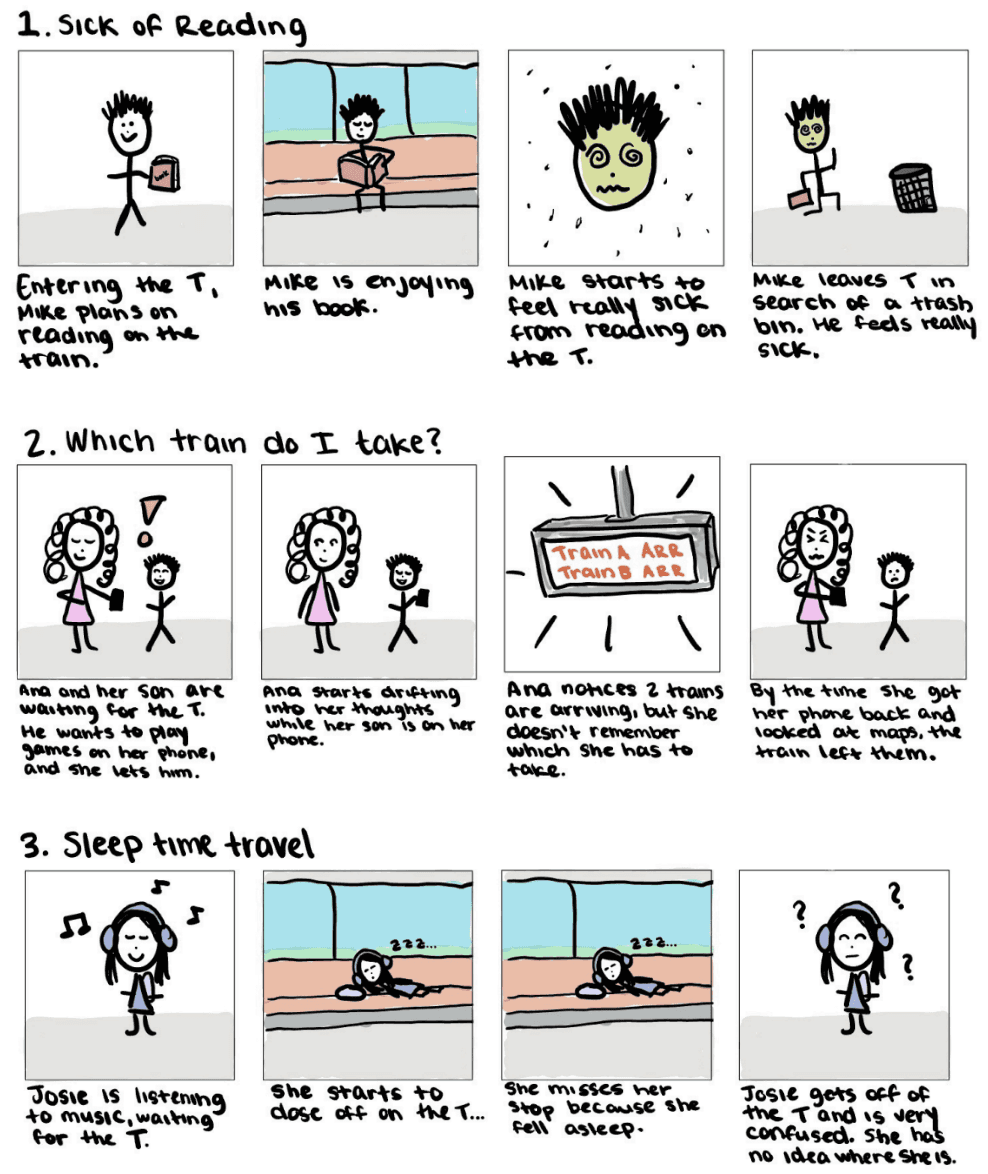
UX Scenarios
To start off this project, I went to my local train station and observed commuters behavior from the entire user journey, from entering the train station to getting off at the next stop. I identified some ux themes through different patterns I witnessed. I created sketches to help depict some scenarios that could happen inspired by the aforementioned observations.
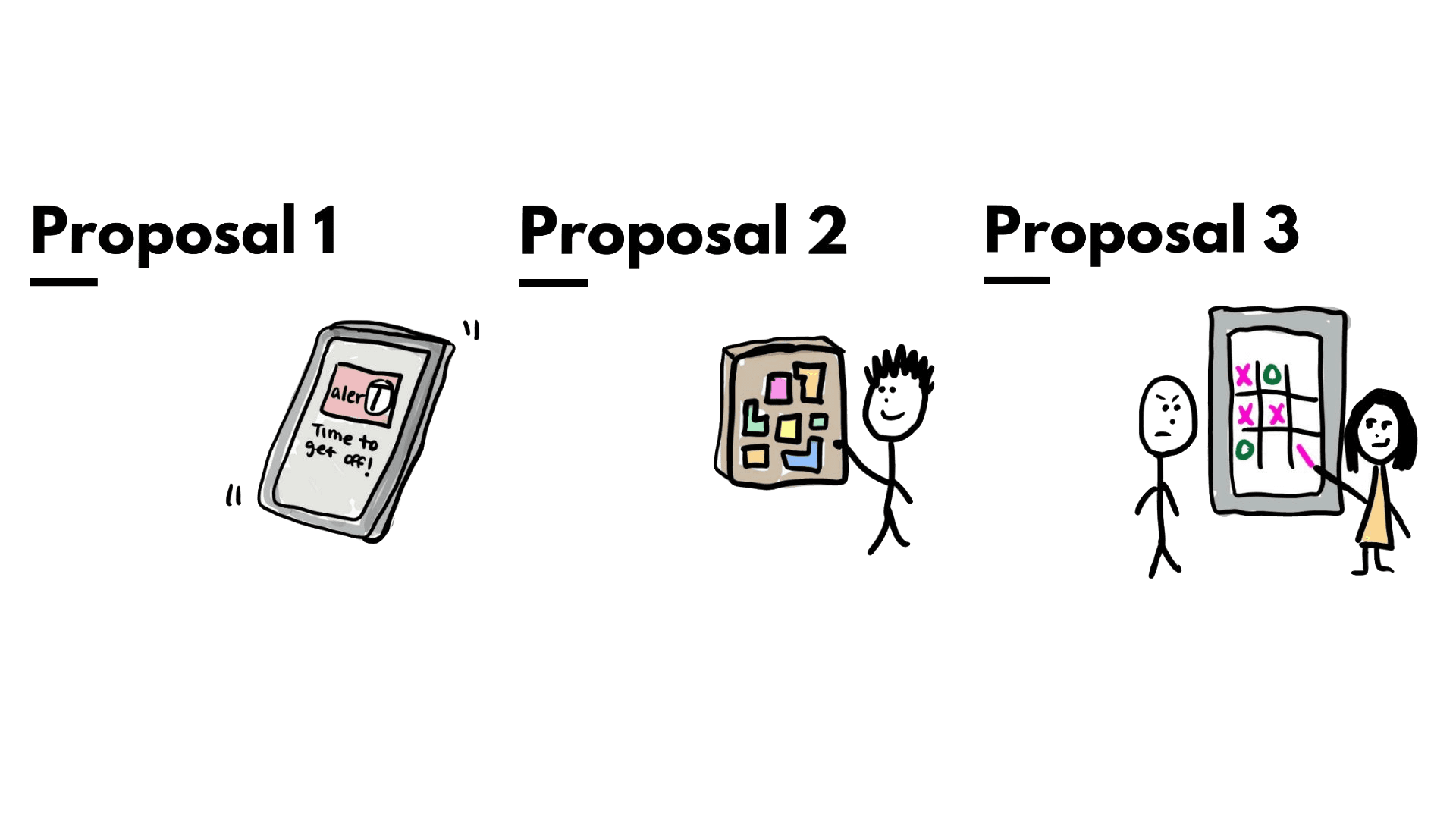
Proposals
Proposal 1
Observed Challenge/Pain Point - Risk of people missing their stop due to falling asleep or getting distracted.
Proposed Design Solution - A mobile app that helps alert train travelers and make them aware of their surroundings.
Technology Considerations - A mobile app that integrates with the train's digital signage system to provide real-time notifications and alerts.
Proposal 2
Observed Challenge/Pain Point - People are bored waiting for the MBTA and need to pass the time, but not to the point where they miss their train.
Proposed Design Solution - A physical puzzle board will engage commuters and will keep the from motion sickness.
Technology Considerations - No technological considerations, just needs physical pieces to add to the train.
Proposal 3
Observed Challenge/Pain Point - Risk of people missing their stop due to falling asleep or getting distracted.
Proposed Design Solution - An interactive, digital display with entertainment and games for the station.
Technology Considerations - Ensure the displays are in each station; Make sure that the games and entertainment are working properly.
First-Hand Research
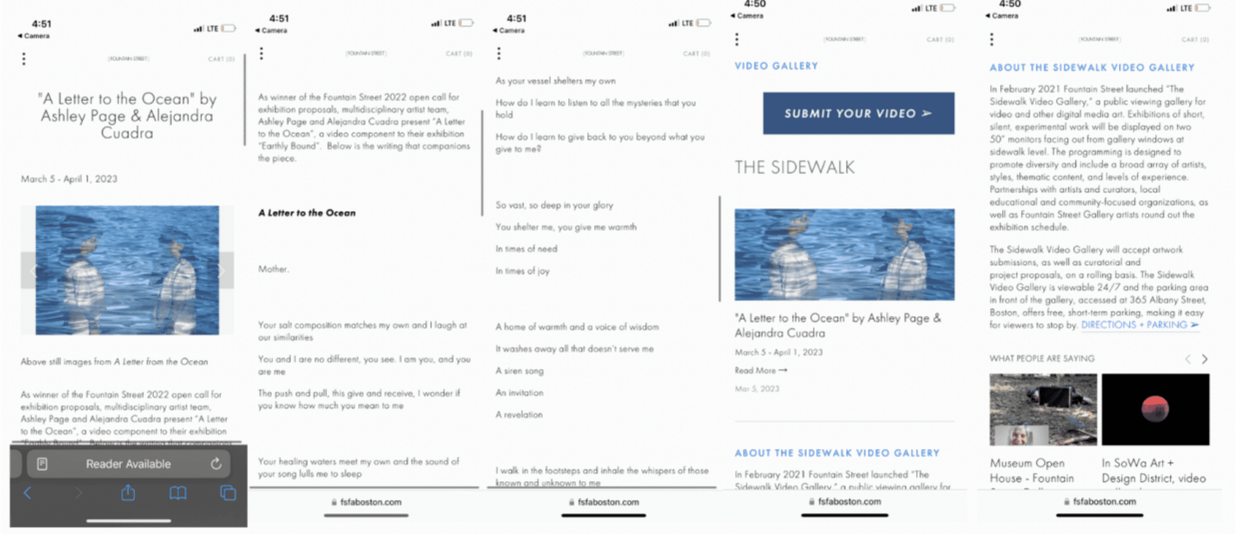
Sidewalk Video Gallery
I was walking in East Boston and I ended up finding a digital interaction displaying artwork. The screens were able to be seen through a window on the sidewalk, and its a gallery displaying diverse artists with poetry and writing linked to it. The QR code allowed you to go to a website, which I drew inspiration from when designing my mobile interface. Press here for link to their site.

Second-Hand Research
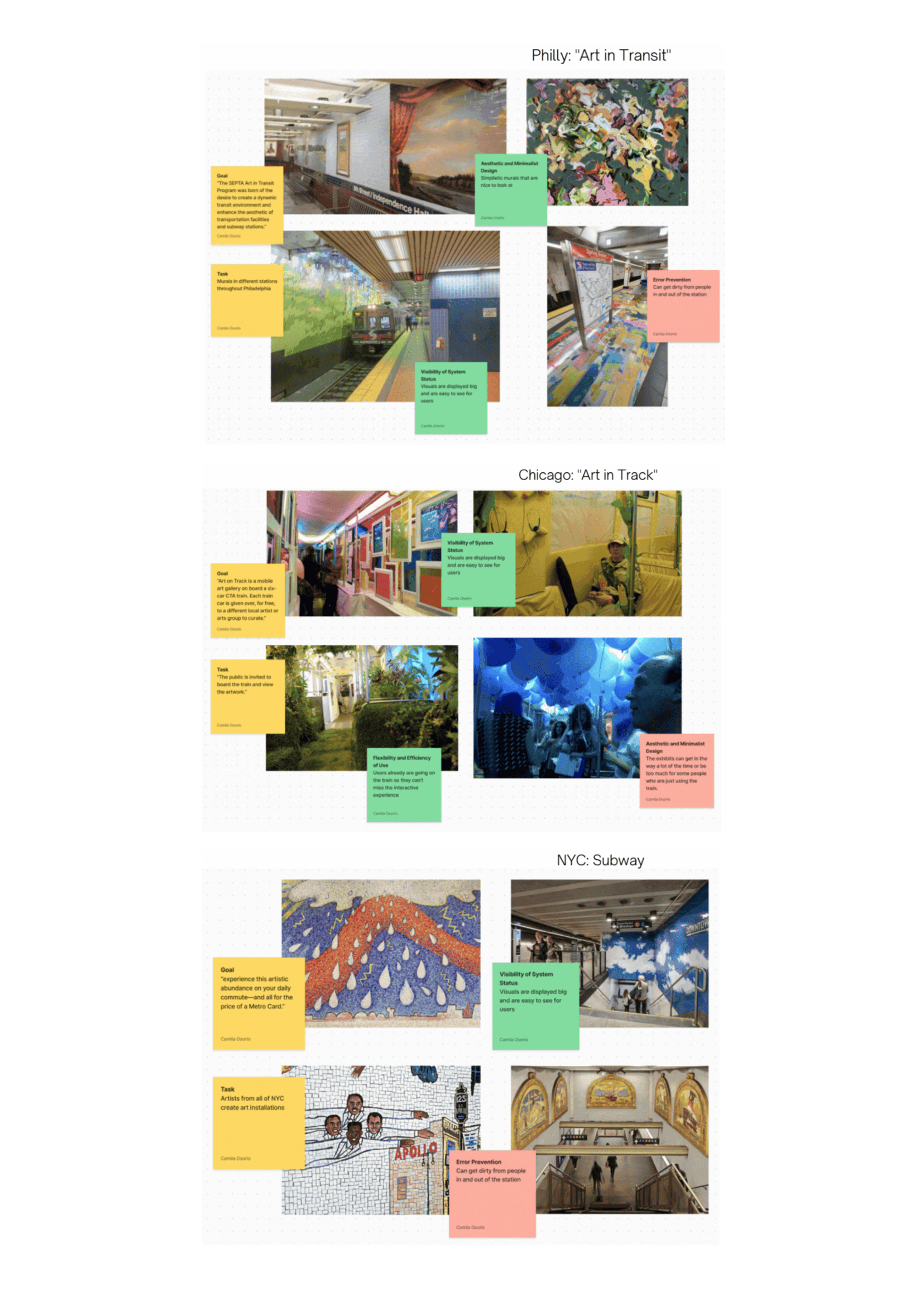
Philly: "Art in Transit"
Easy to see
Colorful and pleasing to look at
Can get dirty and deteriorate as time goes on
I can take from this to make visuals that are easy for everyone to see and bring attention to it
Chicago: "Art in Transit"
Engaging
People seem very interested and post about it It can be a lot for people who are just trying to get somewhere
I can take from this is to create something that is engaging but doesn’t necessarily interrupt the days of people who don’thave the time for it
NYC: Subway
Engaging
Visually appealing
Art installations deteriorate over time
Art is created by artists who are very well known
I should take from this the benefits of having artwork done by professionals
define.
Final Proposal
Observed Challenge/Pain Point - Everyone is on their phones or zoned out in their own world when waiting at the MBTA, but there is no sense of community or engagement.
Proposed Design Solution - An interactive, digital display with different artwork created by art students throughout Boston.
Technology Considerations - Ensure the displays are in each station; Make sure that the art is being displayed and that it transitions between artwork.
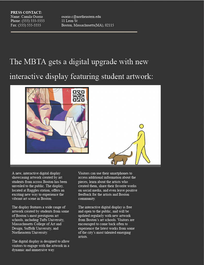
Future Press Release
This was created to show how the outreach marketing would look like if the installation was built.
User Persona + Journey

Style Guide
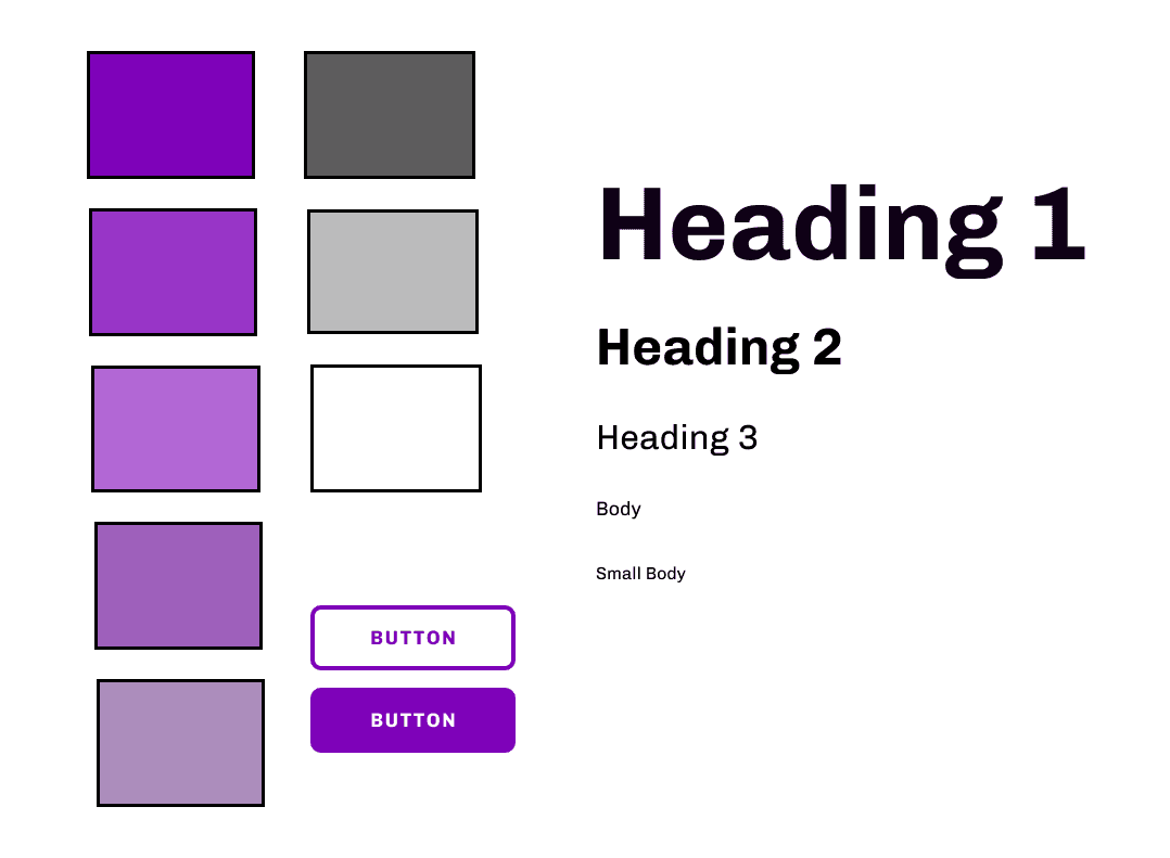
General branding guidelines for the UX/UI of the design.
ideate.
Low-Fidelity Wireframes
To the left, I sketched out the use case for the interaction, in which the digital interaction has a QR code, and from there people are sent to a website on their phone. The arrow points to the low-fi mobile website through a mobile view. The image to the right is a snapshot of the screen of the QR code that would inspire my later designs.

Usability Narrative and Scenario
UX Narrative
Jonathan, a senior in highschool, is currently stressed out. He is applying to colleges, and he doesn’t know where to apply or for what major. After school, to get home he takes the T because it is cheaper than taking an uber, and his home is right by the T stop. He is bored waiting for the T, and he notices this huge digital display in the station. He starts looking at the art that is on the board and he really likes one of the pieces. He notices a QR code in the corner, and decides to scan it and learn more about the artist.
Usability Scenario
The user is stressed and bored at the T station. The digital display catches your eye, and it helps pass time while waiting for the train. The art that pops up on the display is really interesting and you realize that a college student created it. You want to learn more about the art, how it was created, and who the artist is. You want to learn more.
User Testing
College Artists’ Digital Display Intervention Role Play
Objective
The objective of the display is to engage users in the T station
To see how many people care enough to look at the display
How intuitive it is for people to scan the QR code
How easy it is to give feedback and connect
GOAL: If the interactive display is effective in its purpose of bringing attention to college student artists and making the community more aware and together
Props
Digital Display (for the role play, laptop)
QR code (it can send you to the figma prototype)
Artwork for the display (art found online)
Environment
Ideal environment would be at Ruggles (For the role playing and testing, using the QR code in class is also effective as long as the prototype is usable)
Characters
Anyone who is bored at the T station (in this case it would be Jonathan since he is the user persona)
Description
The person who is role playing as Jonathan will have to go to the T station as if they just got out of school. From there they will see a digital display with student artwork, and they will be able to see a QR code on the corner of the screen. It is important to see how intuitive it is for the user to scan it utilizing their phone, or if the user interacts with the display at all. From there the user ideally will be on the website with more information on the artist and the artwork. It is important to also analyze how easy the website is to use.
GIF
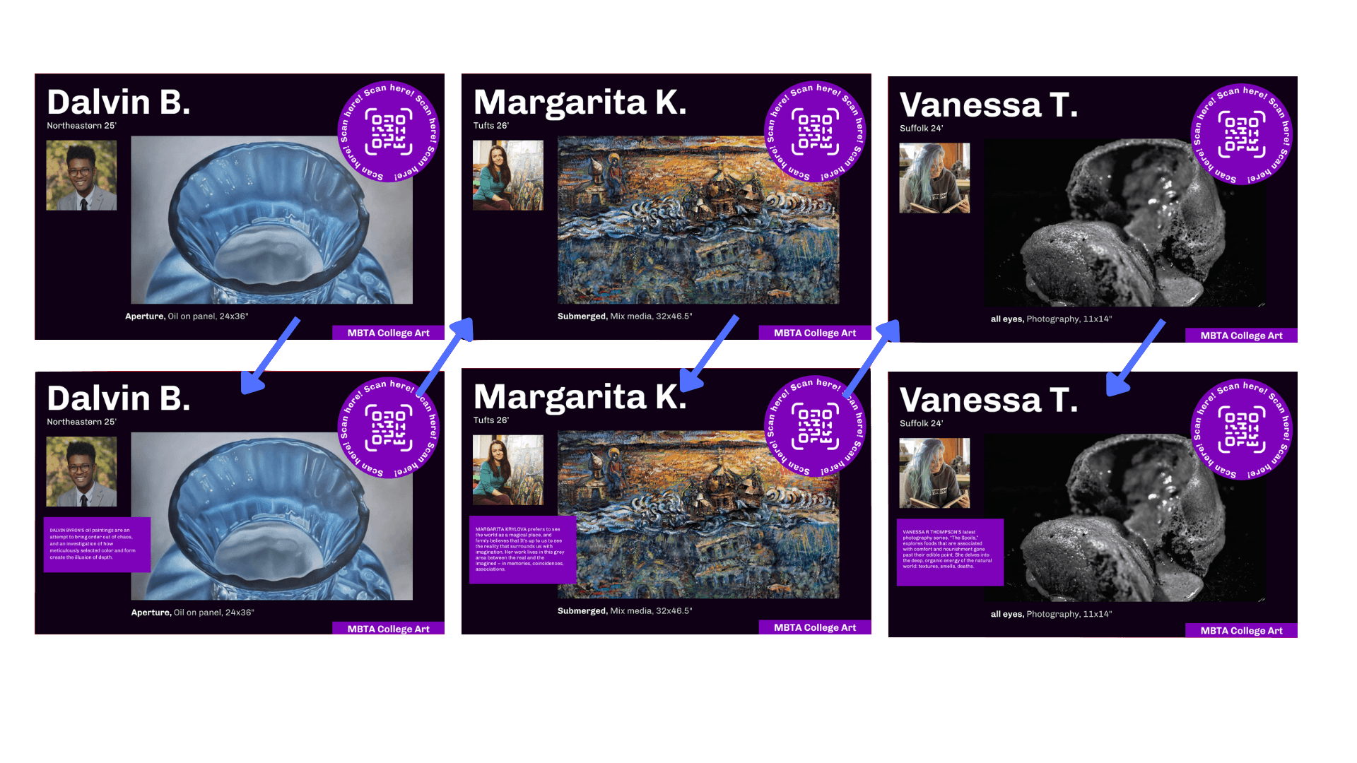
Created this animation to the QR code to grab more attention

prototype.
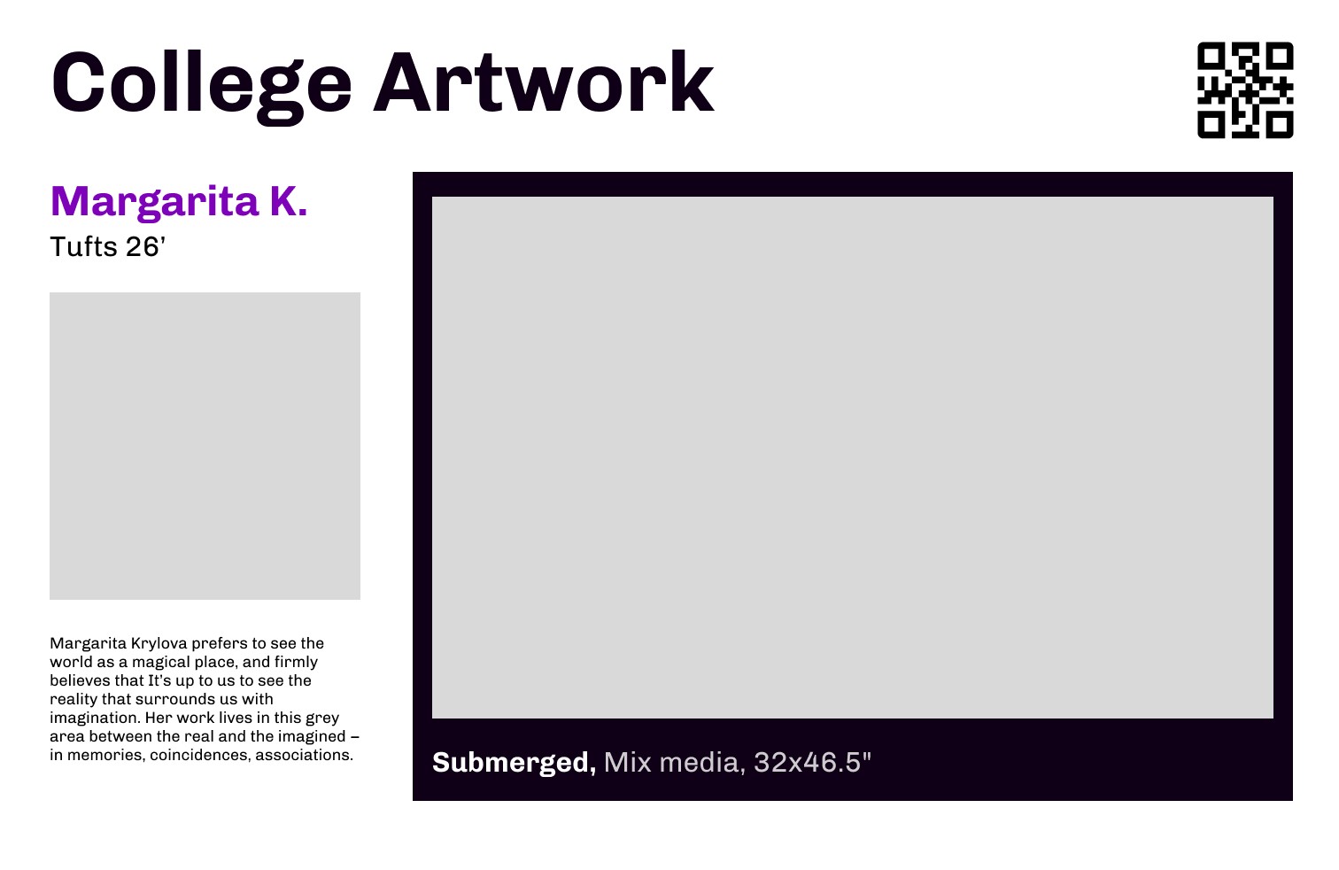
High Fidelity Wireframes

final deliverables.
Video Walkthrough
Main Takeaways
01
When initially brainstorming, I thought my thinking was way too silly to be real design considerations. Sometimes the most outlandish ideas can be some of the best ideas.
02
Adding animation can really elevate designs. I feel like it was always instilled in my head that animations are distracting, but it can be eye catching and make the purpose of a design stand out.
03
Video abstracts can really help others understand the fully use of a design. I didn't realize how helpful it was until doing this project, in which everyone I showed understood the function of the design when they saw the video.

